
Work
anderson tuftex
Elevating livable luxury through photo and video production and catalog design for Anderson Tuftex.


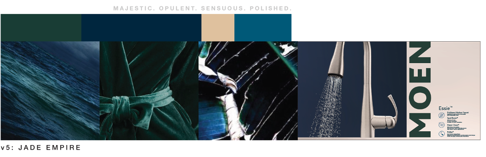
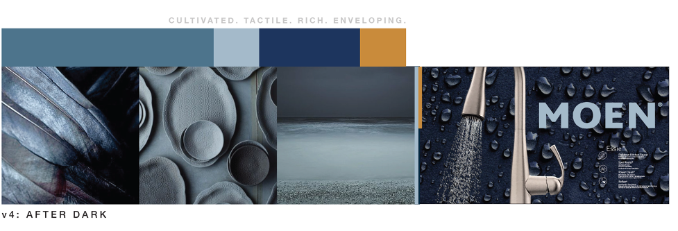
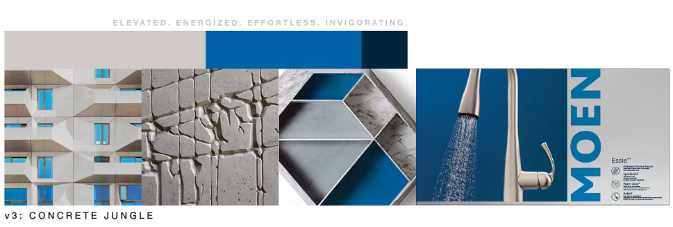
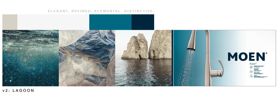
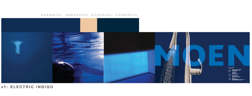
MOEN, the leading faucet brand in North America, was looking to find an agency with deep color expertise. Their team developed a refreshed modern logo in 2017, moving from their iconic two-flame mark to a simpler, bolder look. They needed to select a new color for their logo but kept getting hung up in the selection process. The new logo needed to look great on the shelf in both high-end and big-box stores. They wanted it to stand out from the competition, reflect their high-level aesthetic and be timeless—all very important considerations for a world-class company like MOEN.
Color Marketing Group® referred them to Britton Marketing & Design Group, with our long history in color development and color expertise.
The creative team members at Britton, who follow many international color and trend forecast organizations, have a deep love for all things colorful. We did the necessary research to “look forward” for MOEN in their color search. What was out there? What were similar companies or home brands already using? Where was the future of color going?
Britton provided five concepts with an intentional focus on water, utilizing blue-green themes. MOEN was thrilled with the results. In fact, they liked multiple palettes, so we mocked up some packaging concepts to help finalize their primary, secondary and tertiary colors choices.
Elevating livable luxury through photo and video production and catalog design for Anderson Tuftex.

Values-driven branding and marketing is more important than ever. This is our proven five-step research process for identifying your brand’s economically sustainable path forward

Our clients include some of America's favorite home goods and fashion brands. We help brands develop meaningful customer relevance and engagements.